Paolo Angelucci Leather works
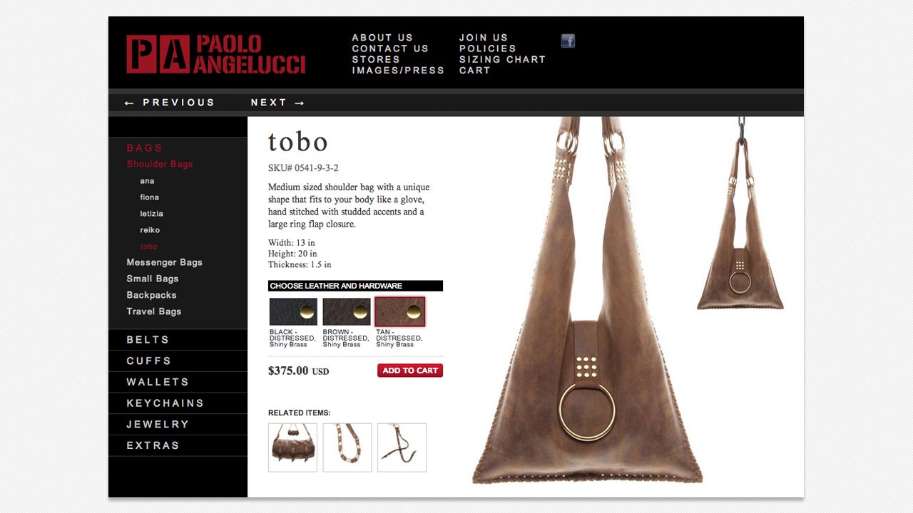
Paolo's graphic designer contacted me for what turned out to be a real challenge of an interface. At least it was back in 2009. The Paolo Angelucci website needed an e-store which required the standard stuff: cart, processor, gateway, and product browser. But the real task was the site interface and user experience.
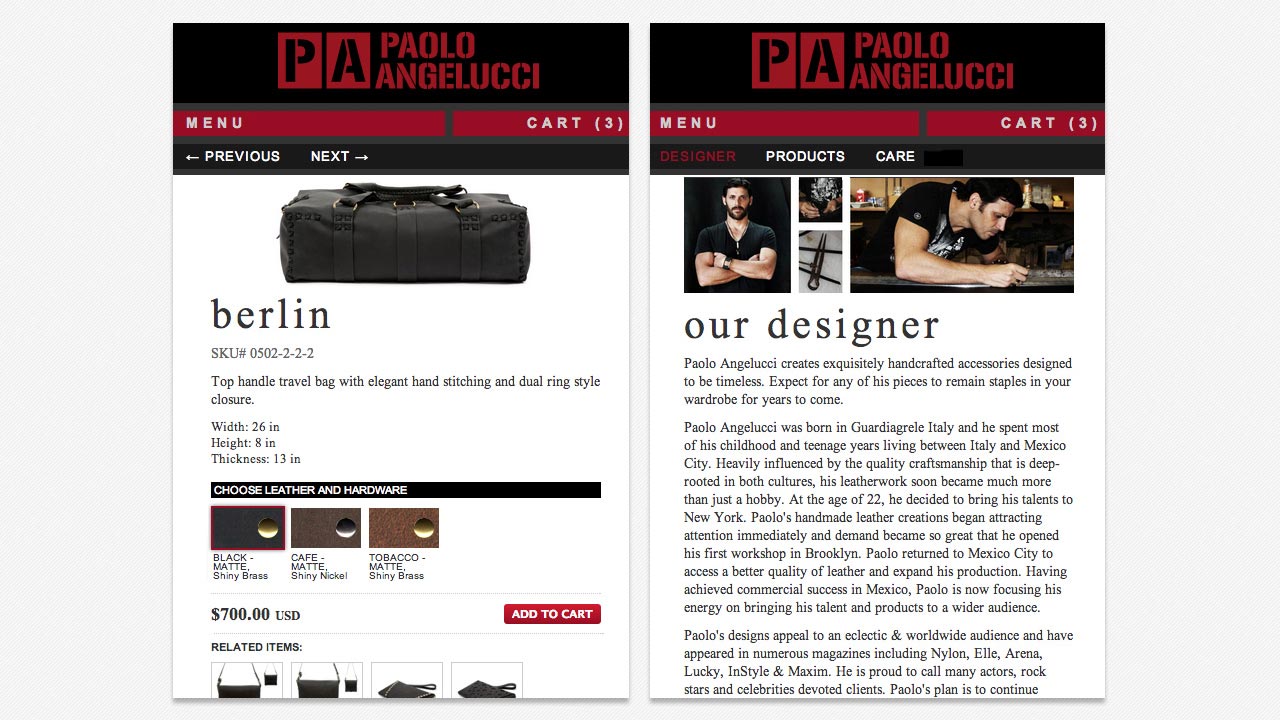
This browser had to allow for categories and variations of products with multiple prices per variation. Okay, that's just good database design, no biggie. But the UI had to be, according to the design spec, completely responsive and full-screen (vertically) at every size.
Of course, the term 'responsive' was fairly new back then. There were a few sites that changed according to page width but CSS3 media queries were barely ready for prime-time.
Anyone who knows anything about web design should be familiar with what was, back in 2009, the asinine status of what we now call the Flex-Box Model. Suffice it to say that the Paolo Angelucci website was a perfect candidate for something that did not yet exist.
The hoops that I had to jump through to get the site to do what it did, and perform well under mobile bandwidths, well, the memories make me shiver.
The Paolo Angelucci website was fully responsive, used HTML5 video, audio, and graphics and featured a product browser and e-store. The Store interfaced to customised builds of foxycart and authorize.net and the USPS for logistics requests.
Unfortunately, the site is no longer in use.
Paolo Angelucci has some pretty awesome leather gear, I suspect that you'll find something you like if you give it the once-over.
